Microsoft has decided to conceal some applets (pages) of the traditional Control Panel in the future releases of Windows 10.
With Windows 8, Microsoft introduced a beginner friendlier and modern Settings app. The new Settings app is good enough for personalization of Windows 10 as it gives you access to background photos, themes, accents, fonts, audio, etc.
In general, this new interface is not adequate for advanced configurations. Control Panel has always offered more options than the modern replacements, including the Settings app. This is mainly due to two reasons: limited UWP APIs and Microsoft’s inability to migrate the legacy components.
With upcoming updates, Microsoft is taking another step to kill off some pages in the Control Panel.
System Applet
In Windows 10 October 2020 Update, Microsoft is removing the ‘System’ applet of Control Panel, which gives you an overview of your system specs, such as the processor and amount of RAM you have installed.
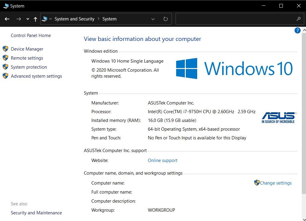
The System page of the Control Panel now redirects you to the Settings app and you cannot access the above screen in future versions of Windows.
The good news, at least, is that Microsoft has improved the Settings app. In fact, the ‘System’ page replacement is a lot more useful.
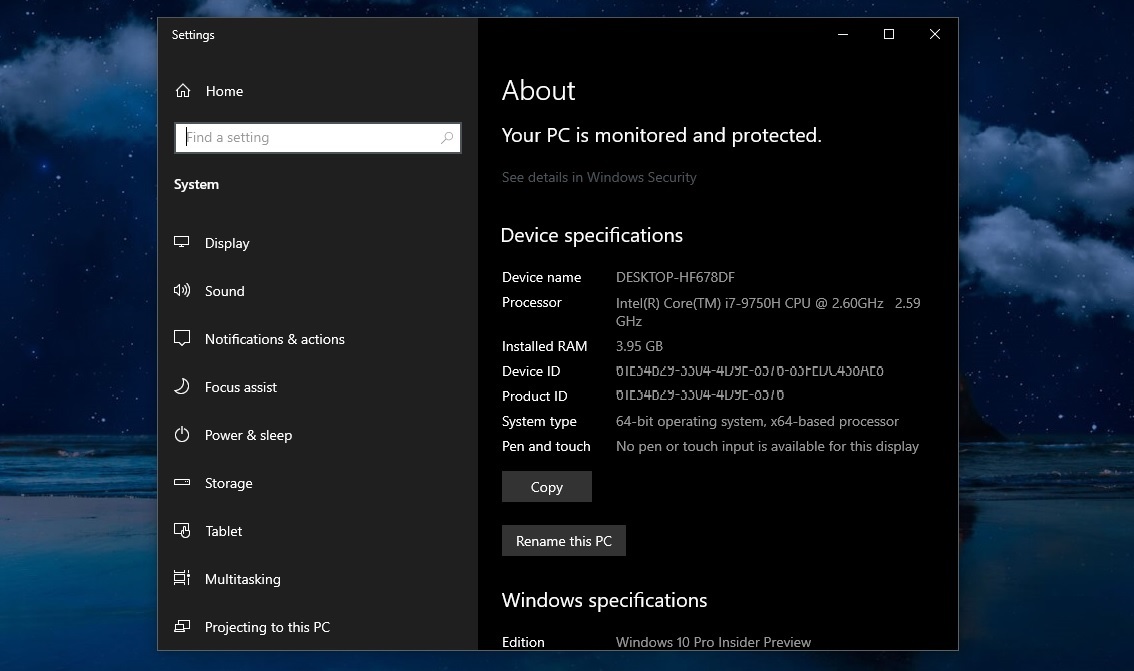
The ‘About’ page, which is going to replace the ‘System’ page, comes with all the information available in the Control Panel. It also includes a new button to copy your system specs, including the OS build number.
Program & Features
Microsoft is also killing off the section in the Control Panel where you can uninstall programs.
In a Windows 10 update, which is expected to arrive next year, Microsoft will begin redirecting users opening Programs and Features under Control Panel to “Apps & Features” in Settings instead.
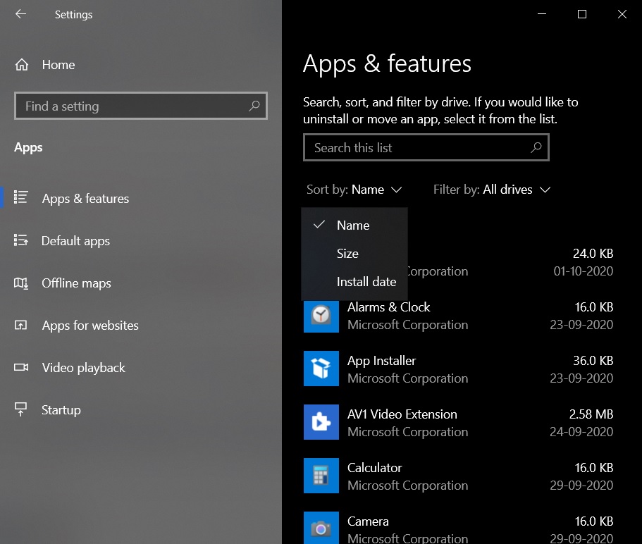
While the Apps & Features page has all the features provided by Control Panel, some users may not like user interface.
Settings app offers a list-based layout and items sit below one another. On the other hand, the Control Panel offers a table-based layout where items sit vertically with additional information in each column and rows.
In the above case, the Control Panel’s modern replacement uses a lot of spacing and also reduces the number of apps that are listed on a single page.
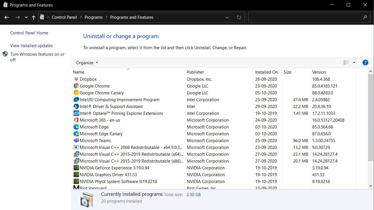
Likewise, Apps & Features page also doesn’t come with a sticky header for the sorting options. That means you need to scroll to the top to access the Filter options provided by the modern Settings app.
Disk Management
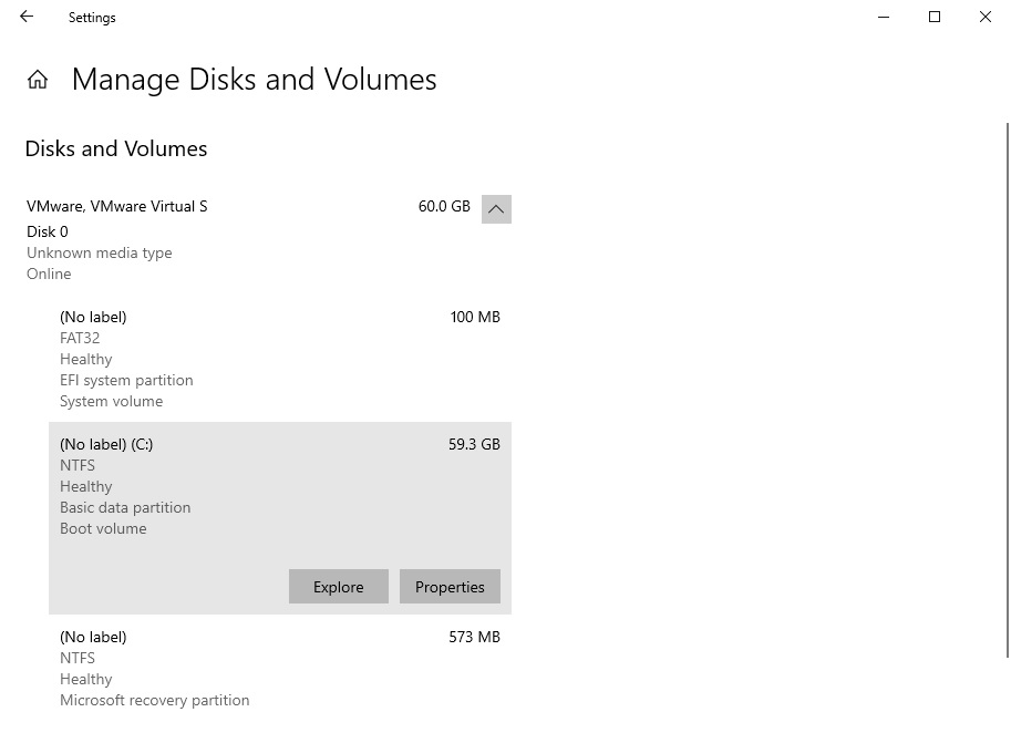
Windows 10’s preview build also comes with a new modern tool that lets you manage the disk management area within the operating system. You can access the new “Manage Disks and Volumes” screen under Settings > System > Storage.
This new tool is Microsoft’s modern alternative to Disk Management (Microsoft Management Console) snap-in.
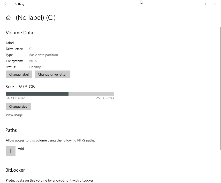
It currently comes with a very basic user interface and better integration with Windows 10’s Storage Settings, but multiple key features are missing in the modern version when compared to the current Disk Management snap-in.
For example, the new disk tool is unable to display a graphical representation of the physical drives installed.
Likewise, if you open a volume or partition, you cannot browse the information of other volumes/partitions. The navigation is limited to a particular storage volume/partition only.
On the other hand, the legacy Disk Management tool comes with two sections: Top Section and the bottom section. The top section contains a list of all the partitions that Windows recognizes and bottom section comes with a graphical storage representation of the drives.
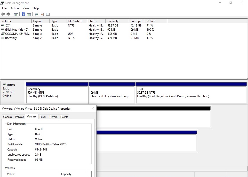
At least for now, Microsoft has confirmed that the legacy Disk Management utility won’t be redirected to the modern version.
Storage Spaces
In freshly released preview builds, Microsoft is testing a flag that will enable access to a modern version of the Storage Spaces feature.
For those unaware, Storage Spaces is a feature that lets you create a ‘Pool’ where the multiple disks of different sizes and interfaces are grouped together. Windows 10 sees Pool (Storage Spaces) as one large disk.
The feature is currently available in the Control Panel only, but it’s also coming to the Settings app in a future release of Windows 10.
The post Closer look at Windows 10’s new replacements for Control Panel features appeared first on Windows Latest
Thank you for viewing the article, if you find it interesting, you can support us by buying at the link:: https://officerambo.com/shop/
No comments:
Post a Comment