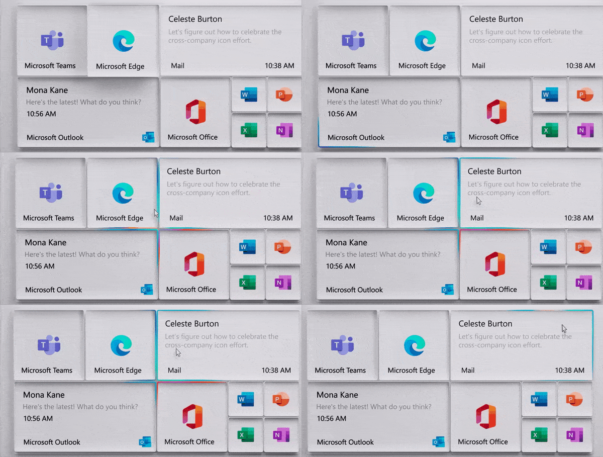
Windows 10 appears to be in the process of design overhaul with modern icons, improved Start Menu, and more Fluent Design goodness.
A popup posted to Microsoft’s Tips & Tricks page recently suggested that Microsoft will smooth out the corners of Start Menu tiles and get rid of the sharp edges. Now, it appears that Microsoft is planning another aesthetic update for the Start Menu, according to a new concept posted by Microsoft’s design group.
In a new video (embedded below), Microsoft showed off a concept of what the Start Menu could look like if flashy rainbow effects were implemented around the Live Tiles.
This new official concept also uses Microsoft’s new icons and features a slight drop shadow effect that helps the icons pop.
In addition, Microsoft has also teased a new icon for the Action Center (notifications center).

It’s worth noting that these are official concepts from Microsoft’s designers and this isn’t intended to be a final product. At the moment, Microsoft is exploring design ideas for Start Menu for making the new icons fit better with the tile interface on Windows 10.
One of the explorations includes implementing flashy rainbow effect behind the transparent tiles on light or dark mode.
The post Microsoft shows off its concept for Windows 10’s new Start Menu appeared first on Windows Latest
Thank you for viewing the article, if you find it interesting, you can support us by buying at the link:: https://officerambo.com/shop/
No comments:
Post a Comment