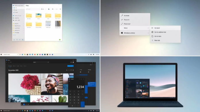
Internally, Microsoft has been reorganizing the teams that work on Windows and Azure. As part of the reorg, Microsoft is bringing more Windows 10 development teams under Panos Panay, the head of the successful Surface lineup. According to sources, these internal changes could improve Windows OS in a big way.
While Windows 10 is more popular than ever, it’s no secret that the operating system is due for design improvements.
We know that Microsoft is looking to redesign the iconic Start menu in Windows 10 with the version 20H2, and now the company has also started working on a new rounded corners look for the OS.
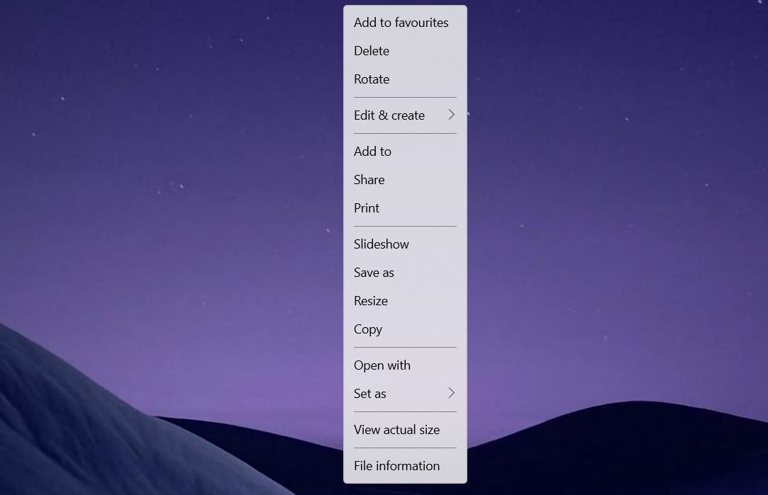
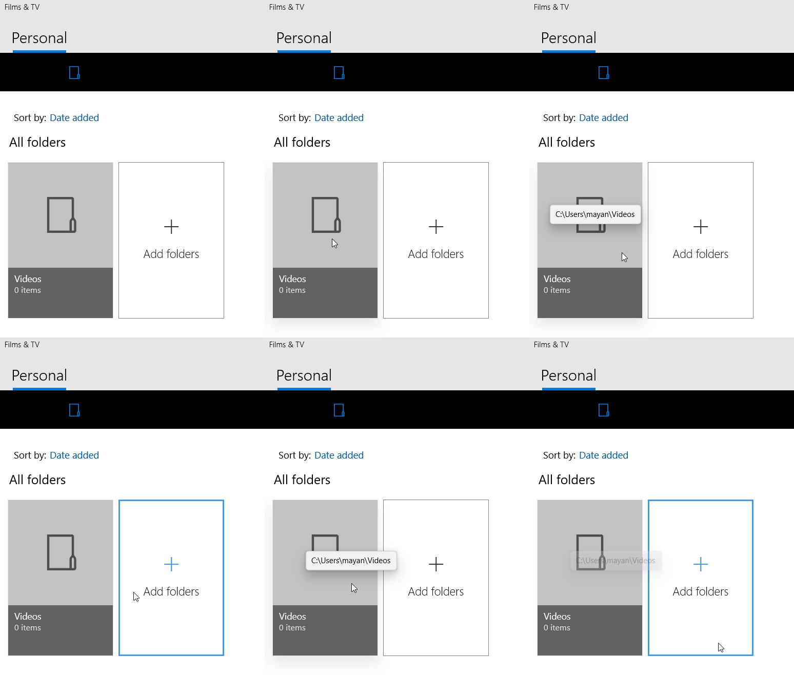
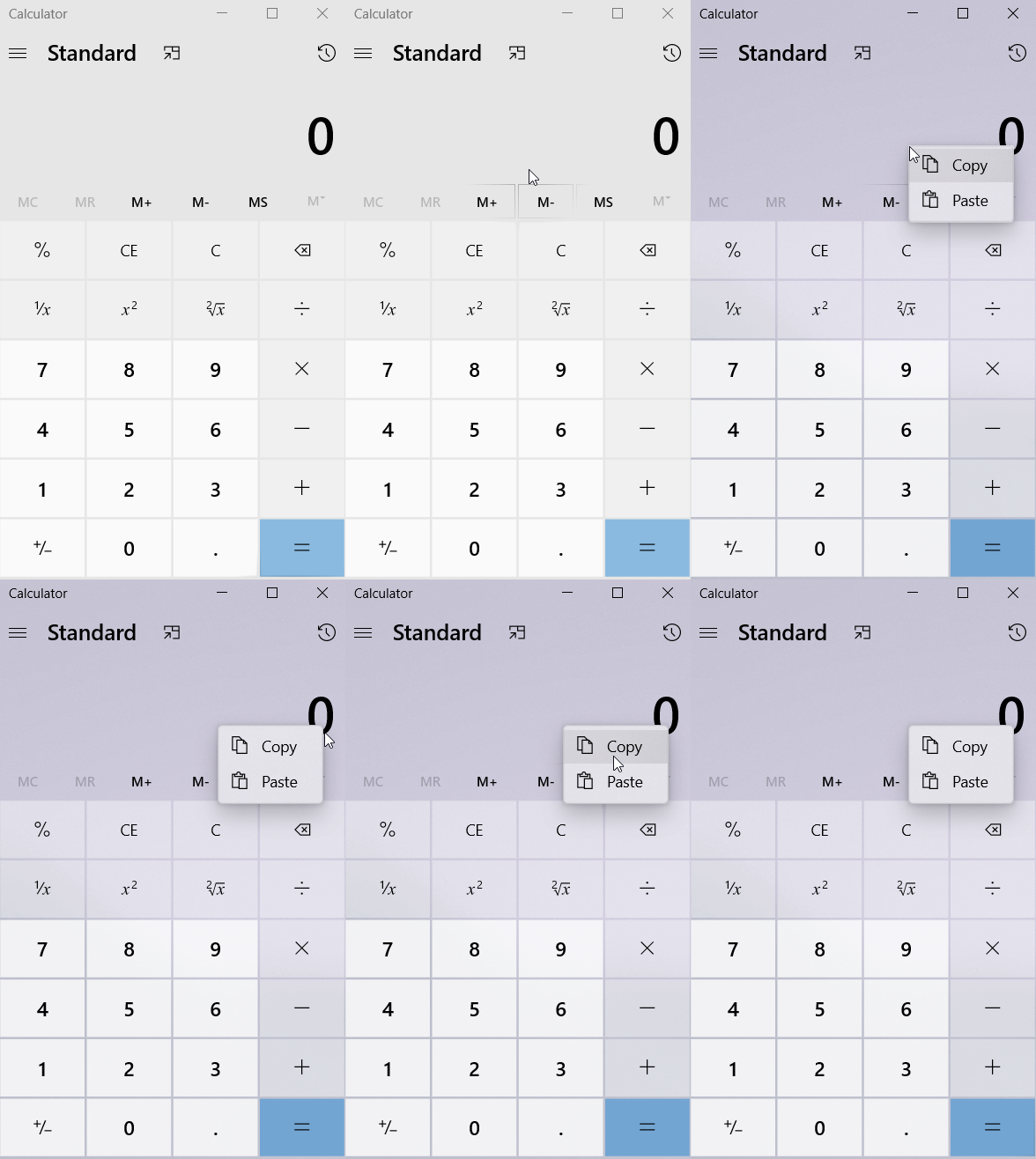
Over the past few weeks, Microsoft has pushed out updates to Windows 10 Photos app, Windows Calendar, Windows Maps, Movies & TV, Sticky Notes, and even Calculator with new rounded corners makeover.

You’ll notice the subtle change in the look of these apps when you open the context menu (which you can access by right-clicking on a surface).
The old look of these inbox apps features sharp corners. These new changes are in contrast to macOS Big Sur, which also uses rounded corners in its design language, but Microsoft’s implementation would be more subtle, thanks to the Fluent Design.

This design update has arrived one year after Microsoft promised rounded corners for default control styles in XAML apps. As I noted in my last report, the broad aim here is to make the common controls consistent and available across all Windows 10 apps.

Microsoft is also believed to be working on design improvements for the desktop-based Start Menu and Action Center. The new preview release of Windows 10 includes references to ‘WinUI’ for Start Menu and Action Center.
What’s WinUI? In simple terms, WinUI is Microsoft’s latest interface platform, which will be used in Windows 10X and Surface Neo. It’s also available for the developers and the platform makes it easy for developers to build modern and seamless UIs that feels natural on all form factors.
WinUI also uses Fluent Design and it includes transparency, rounded corners, and more to give Windows a bit more visual flair.
Of course, this new rounded look for the interface is still very much at the development and testing stage, so we don’t know if and when it will actually be realized in Windows 10 for the core areas, such as the Start Menu.
Thank you for viewing the article, if you find it interesting, you can support us by buying at the link:: https://officerambo.com/shop/
No comments:
Post a Comment